
【前端】el-table当内容过长被隐藏时显示 tooltip,自定义封装el-tooltip实现更好的效果
el-table当内容过长被隐藏时显示 tooltip,封装el-tooltip,类似show-overflow-tooltip
·
在table使用属性show-overflow-tooltip(当内容过长被隐藏时显示)展示效果不太好,样式也比较难改造,采取封装el-tooltip的方式重新处理,具体处理如下:
1、封装控件el-tooltip(自定义背景颜色[popper-class]、去掉箭头[visible-arrow])
<template>
	<div>
		<el-tooltip :disabled="isShowTooltip" popper-class="tips" :visible-arrow="false" class="tooltip"  placement="bottom-start" effect="light">
			<pre class="tooltip__tip" slot="content">{{ message }}</pre>
			<div class="tooltip__words" @mouseenter="enterEvents">{{ message }}</div>
		</el-tooltip>
	</div>
</template>
<script>
export default {
	data() {
		return {
			messageWord: '',
			isShowTooltip: false
		}
	},
	props: {
		message: {
			required: true
		}
	},
	mounted() {
	},
	methods: {
		enterEvents(e) {
			let tableContentBoxWidth = e.target.getBoundingClientRect().width;
			let tableContentWidth = this.getElementTextWidth(e.target);
			if (tableContentWidth >= tableContentBoxWidth) {
				this.isShowTooltip = false;
			}else{
				this.isShowTooltip = true
			}
		},
		getElementTextWidth(el) {
			const range = new Range();
			range.selectNodeContents(el);
			const width = range.getBoundingClientRect().width;
			return width
		}
	}
}
</script>

<style lang="less" scoped>
.tips {
  //自定义背景颜色
  background: #83B8FE !important;
  border-color: #DDDDDD !important;
}
.tooltip__words {
	width: 100%;
	white-space: nowrap;
	overflow: hidden;
	text-overflow: ellipsis;
	color: #343434;
}
.tooltip__tip {
	max-width: 500px;
	max-height: 300px;
	overflow-y: auto;
	white-space: pre-line;
	line-height: 1.5;
	font-size: 14px;
	white-space: normal;
	word-break: break-all;
	padding: 5px;
	margin: 0;
	color: #343434;
}

.tooltip__tip::-webkit-scrollbar  {
	width: 6px;
}

.tooltip__tip::-webkit-scrollbar-thumb {
	background: #ccc; // 滑块颜色
	border-radius: 3px; // 滑块圆角
}

.tooltip__tip::-webkit-scrollbar-thumb:hover {
	background: #fff; // 鼠标移入滑块颜色
}

.tooltip__tip::-webkit-scrollbar-track {
	border-radius: 3px; // 轨道圆角
	background-color: #888 // 轨道颜色 ;
}
</style>
2、在table里调用封装的控件
<template>
  <el-table
    :data="tableData"
    stripe
    style="width: 100%">
    <el-table-column
      prop="date"
      label="日期"
      width="180">
      <template slot-scope="scope">
       <tooltip :message="scope.row.date"></tooltip>
      </template>
    </el-table-column>
    <el-table-column
      prop="name"
      label="姓名"
      width="180">
      <template slot-scope="scope">
       <tooltip :message="scope.row.name"></tooltip>
      </template>
    </el-table-column>
    <el-table-column
      prop="address"
      label="地址">
      <template slot-scope="scope">
       <tooltip :message="scope.row.address"></tooltip>
      </template>
    </el-table-column>
  </el-table>
</template>

<script>
  import tooltip from "@/components/tooltip";
  export default {
  components: { tooltip },
    data() {
      return {
        tableData: [{
          date: '2016-05-02',
          name: '王小虎',
          address: '上海市普陀区金沙江路 1518 弄'
        }, {
          date: '2016-05-04',
          name: '王小虎',
          address: '上海市普陀区金沙江路 1517 弄'
        }, {
          date: '2016-05-01',
          name: '王小虎',
          address: '上海市普陀区金沙江路 1519 弄'
        }, {
          date: '2016-05-03',
          name: '王小虎',
          address: '上海市普陀区金沙江路 1516 弄'
        }]
      }
    }
  }
</script>
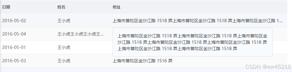
3、效果展示
原版效果: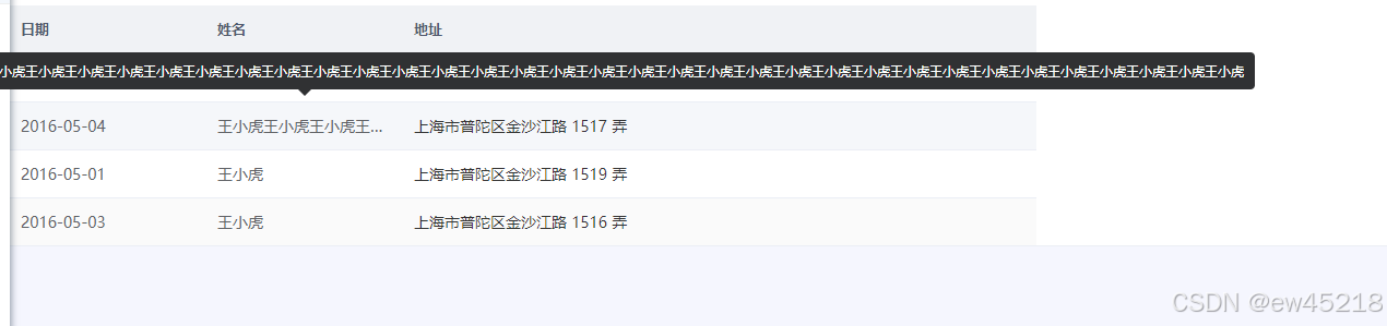
改造效果:
4、进阶处理版
实现第一列只移动到文字上实现浮动变蓝和点击触发,在非文字区域不触发(想整格触发就把span换成div),一般用于点击打开页面的样式效果。
<template>
  <div v-if="index != 0">
    <el-tooltip :disabled="isShowTooltip" popper-class="tips" :visible-arrow="false" class="tooltip"
      placement="bottom-start" effect="light">
      <pre class="tooltip__tip" slot="content">{{ message }}</pre>
      <div class="tooltip__words" @mouseenter="enterEventsDiv">{{ message }}</div>
    </el-tooltip>
  </div>
  <span v-else>
    <!--div换成了span  多了tab_cli -->
    <el-tooltip :disabled="isShowTooltip" popper-class="tips" :visible-arrow="false" class="tooltip"
      placement="bottom-start" effect="light">
      <pre class="tooltip__tip" slot="content">{{ message }}</pre>
      <span class="tooltip__words tab_cli" @mouseenter="enterEventsSpan">{{ message }}</span>
    </el-tooltip>
  </span>
</template>
<script>
  export default {
    data() {
      return {
        messageWord: '',
        isShowTooltip: false
      }
    },
    props: {
      message: {
        required: true
      },
      //为0时用于第一列处理
      index: {
        required: false,
      }
    },
    methods: {
      //处理 div 的逻辑
      enterEventsDiv(e) {
        let tableContentBoxWidth = e.target.getBoundingClientRect().width;
        let tableContentWidth = this.getElementTextWidth(e.target);
        if (tableContentWidth >= tableContentBoxWidth) {
          this.isShowTooltip = false;
        } else {
          this.isShowTooltip = true
        }
      },
      // 处理 span 的逻辑
      enterEventsSpan(e) {
        // 关键!找到表格(calss为cell)的宽度作为容器宽度,其实这个宽度也可以从父组件传table设置的格子宽度过来
        const parent = e.target.closest('.cell')
        if (!parent) {
          console.log('未找到 .cell 父元素')
          this.isShowTooltip = true
          return
        }
        const tableContentBoxWidth = parent.getBoundingClientRect().width
        const tableContentWidth = this.getElementTextWidth(e.target)

        if (tableContentWidth >= tableContentBoxWidth) {
          this.isShowTooltip = false;
        } else {
          this.isShowTooltip = true
        }
      },
      //获取文本内容宽度
      getElementTextWidth(el) {
        const range = new Range();
        range.selectNodeContents(el);
        const width = range.getBoundingClientRect().width;
        return width
      },
    }
  }
</script>

<style lang="less" scoped>
  .tips {
    background: #F8FBFE !important;
    border-color: #DDDDDD !important;
  }

  .tooltip__words {
    width: 100%;
    white-space: nowrap;
    overflow: hidden;
    text-overflow: ellipsis;
    color: #343434;
  }

  .tooltip__tip {
    max-width: 500px;
    max-height: 300px;
    overflow-y: auto;
    white-space: pre-line;
    line-height: 1.5;
    font-size: 14px;
    white-space: normal;
    word-break: break-all;
    padding: 5px;
    margin: 0;
    color: #343434;
  }

  .tooltip__tip::-webkit-scrollbar {
    width: 6px;
    // height: 10px; // 高度写不写,都不影响,因为会根据内容的长度自动计算
  }

  .tooltip__tip::-webkit-scrollbar-thumb {
    background: #ccc; // 滑块颜色
    border-radius: 3px; // 滑块圆角
  }

  .tooltip__tip::-webkit-scrollbar-thumb:hover {
    background: #fff; // 鼠标移入滑块颜色
  }

  .tooltip__tip::-webkit-scrollbar-track {
    border-radius: 3px; // 轨道圆角
    background-color: #888 // 轨道颜色 ;
  }

  .tab_cli {
    cursor: pointer;

    &:hover {
      color: #0b6cd3;
    }
  }
</style>
参考资料:
1、element-ui官方文档:https://element.faas.ele.me/#/zh-CN/component/tooltip
2、站内文章:https://blog.csdn.net/qq_58441775/article/details/132220586?spm=1001.2014.3001.5506

技术共进,成长同行——讯飞AI开发者社区
更多推荐
 5
5 0
0- 0


 已为社区贡献3条内容

所有评论(0)