
前端css/less绕椭圆轨道旋转动画 带遮挡效果 3D
css 椭圆轨道旋转动画
·
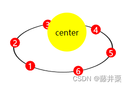
效果如图,多个物体在轨道上绕中心物体旋转,当旋转到物体后面时将被遮挡。主要使用css实现,为了简化代码,引入less进行处理。
html结构
// 中心物体
<div class="center">center</div>
// 轨道
<div class="orbit">
	// 轨道上的物体
	<div class="item item1">1</div>
	<div class="item item2">2</div>
	<div class="item item3">3</div>
	<div class="item item4">4</div>
  <div class="item item5">5</div>
  <div class="item item6">6</div>
</div>
less代码
本质上是使用动画控制轨道带动内部的物体进行旋转,计算出每个物体在椭圆轨道上的位置,使用绝对定位放置物体。由于轨道上物体有多个,代码做了椭圆位置等分计算处理,使用less根据轨道大小和物体个数动态计算各个物体的位置,要添加或减少物体个数只需要在html上添加相应类名的物体并修改less代码中的@num变量即可。
遮挡效果是通过z-index制造视觉差来实现的。
// 轨道旋转动画b
@keyframes spin {
  0% {
    transform: scaleY(0.5) rotate(0deg);
  }
  100% {
    transform: scaleY(0.5) rotate(360deg);
  }
}
@keyframes anti-spin {
  0% {
    transform: rotate(0deg) scaleY(2) scale(1);
  }
  100% {
    transform: rotate(-360deg) scaleY(2) scale(1);
  }
}
// 轨道宽高
@w1: 200px;
@h1: 200px;
@r: @w1 / 2;
// 元素宽高
@w2: 20px;
@h2: 20px;
// 动画时间
@time: 30s;
// 元素个数
@num: 6;
.locateItem(@n, @i: 1) when (@i =< @n) {
  .item@{i} {
    @m: pi() / 180 * round(360 / @n) * @i;
    left: @r + @r * sin(@m) - @w2 / 2;
    bottom: @r + @r * cos(@m) - @h2 / 2;
  }
  .locateItem(@n, (@i + 1));
}
// 旋转中心
.center {
  z-index: 999;
  position: absolute;
  top: 40px;
  left: 120px;
  width: 80px;
  height: 80px;
  background: yellow;
  border-radius: 50%;
  display: flex;
  justify-content: center;
  align-items: center;
}
// 轨道及元素
.orbit {
  z-index: 900;
  position: absolute;
  top: 10px;
  left: 50px;
  width: @w1;
  height: @h1;
  border-radius: 50%;
  border: 2px solid black;
  z-index: 900;
  animation: spin @time infinite linear;
  .item {
    display: flex;
    justify-content: center;
    align-items: center;
    background: red;
    border-radius: 50%;
    width: @w2;
    height: @h2;
    animation: anti-spin @time infinite linear;
    color: #fff;
    position: absolute;
    text-align: center;
  }
  //   对每个元素进行定位
  .locateItem(@num);
}
// 鼠标悬停 动画暂停
.orbit:hover,
.orbit:hover .item,
.orbit .item:hover {
  animation-play-state: paused;
}
可将代码复制到codepen中进行预览:
https://codepen.io/pen/

技术共进,成长同行——讯飞AI开发者社区
更多推荐
 6
6 0
0- 0


 已为社区贡献1条内容

所有评论(0)