
web前端浮动以及练习
适合前端新手练手的简单浮动排版
·
1.浮动的简介
在最初,浮动是用来实现文字环绕图片效果的,现在浮动是主流的页面布局方式之一。
float:left;
float:right;
2.元素浮动后的特点
1.脱离文档流。
2.不管浮动前是什么元素,浮动后:默认宽与高都是被内容撑开(尽可能小),而且可以设置宽高。
3.不会独占一行,可以与其他元素共用一行。
4.不会 margin 合并,也不会 margin 塌陷,能够完美的设置四个方向的 margin和 padding。
5.不会像行内块一样被当做文本处理(没有行内块的空白问题)。
3.解决浮动后带来的影响:
1.方案-:给父元素指定高度。
2.方案二:给父元素也设置浮动,带来其他影响。
3.方案三:给父元素设置 overflow:hidden
4.方案四: 在所有浮动元素的最后面,添加一个块级元素,并给该块级元素设置 clear:both 。
5.方案五: 给浮动元素的父元素,设置伪元素,通过伪元素清除浮动,原理与方案四相同。==>推荐使用
.parent::after {
content:"";
display: block;
clear:both;}
4.浮动排版小练习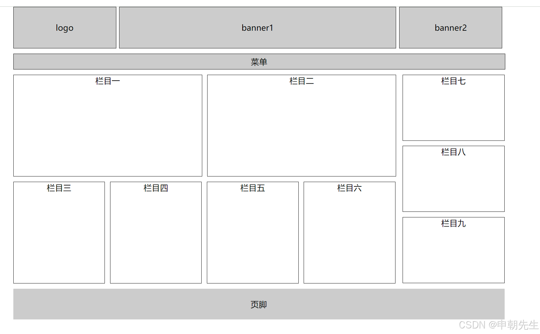
<!DOCTYPE html>
<html lang="zh-CN">
<head>
    <meta charset="UTF-8">
    <meta name="viewport" content="width=device-width, initial-scale=1.0">
    <title>浮动布局练习</title>
    <style>
        * {
            margin: 0;
            padding: 0;
        }
        .zhu{
            width: 960px;
            margin: 0 auto;
            text-align: center;
            /* 这时候,主容器位于版心的地方 */
        }
        .leftfix{
            float: left;
        }
        .rightfix{
            float: right;
        }
        .clearfix::after{
            content: '';
            display: block;
            clear: both;
        }
        .h1,.h2,.h3{
            background-color: #ccc;
            border: 1px solid black;
            line-height: 80px;
            height: 80px;
        }
        .h1,.h3{
            width: 200px;
        }
        .h2{
            width: 540px;
            margin:0 6px;
        }
        .h4{
            background-color: #ccc;
            width: 960px;
            height: 30px;
            margin-top: 10px;
            border: 1px solid black;
            line-height: 30px;
        }
        .h5,.h6{
            /* background-color: #ccc; */
            width:368px;
            height: 198px;
            border: 1px solid black;
            margin-top: 10px;
            text-align: 198px;
        }
        .h6{
            margin-left: 10px;
            margin-right: 10px;
        }
        .h7,.h8,.h9,.h10{
            width: 178px;
            height: 198px;
            border: 1px solid black;
            margin-top: 10px;
            margin-right: 10px;
        }
        .q1,.q2,.q3{
            width: 198px;
            height: 128px;
            border: 1px solid black;
            margin-top: 10px;

        }
        .q2{
            margin: 10px 0;
        }
        .q4{
            width: 960px;
            height: 60px;
            background-color: #ccc;
            line-height: 60px;
            margin-top: 10px;
        }
    </style>
</head>
<body>
    <div class="zhu">
        <!-- 头部 -->
        <div class="clearfix">
            <div class="h1 leftfix">logo</div>
            <div class="h2 leftfix">banner1</div>
            <div class="h3 leftfix">banner2</div>
        </div>
        <div class="h4 leftfix clearfix">
            <!-- 菜单 -->
            菜单
        </div>
        <div class="content clearfix">
            <div class="clearfix">
                <!-- 左侧 -->
            <div class="left leftfix">
                <!-- 上 -->
                <div class="top clearfix">
                    <div class="h5 leftfix">栏目一</div>
                    <div class="h6 leftfix">栏目二</div>
                </div>
                <!-- 下 -->
                <div class="bottom clearfix">
                    <div class="h7 leftfix">栏目三</div>
                    <div class="h8 leftfix">栏目四</div>
                    <div class="h9 leftfix">栏目五</div>
                    <div class="h10 leftfix">栏目六</div>
                </div>
            </div>
            <div class="right rightfix">
                <div class="q1">栏目七</div>
                <div class="q2">栏目八</div>
                <div class="q3">栏目九</div>
            </div>
        </div>
        <div class="q4">页脚</div>
    </div>
</body>
</html>
技术共进,成长同行——讯飞AI开发者社区
更多推荐


 7
7 0
0- 0


 已为社区贡献1条内容

所有评论(0)