
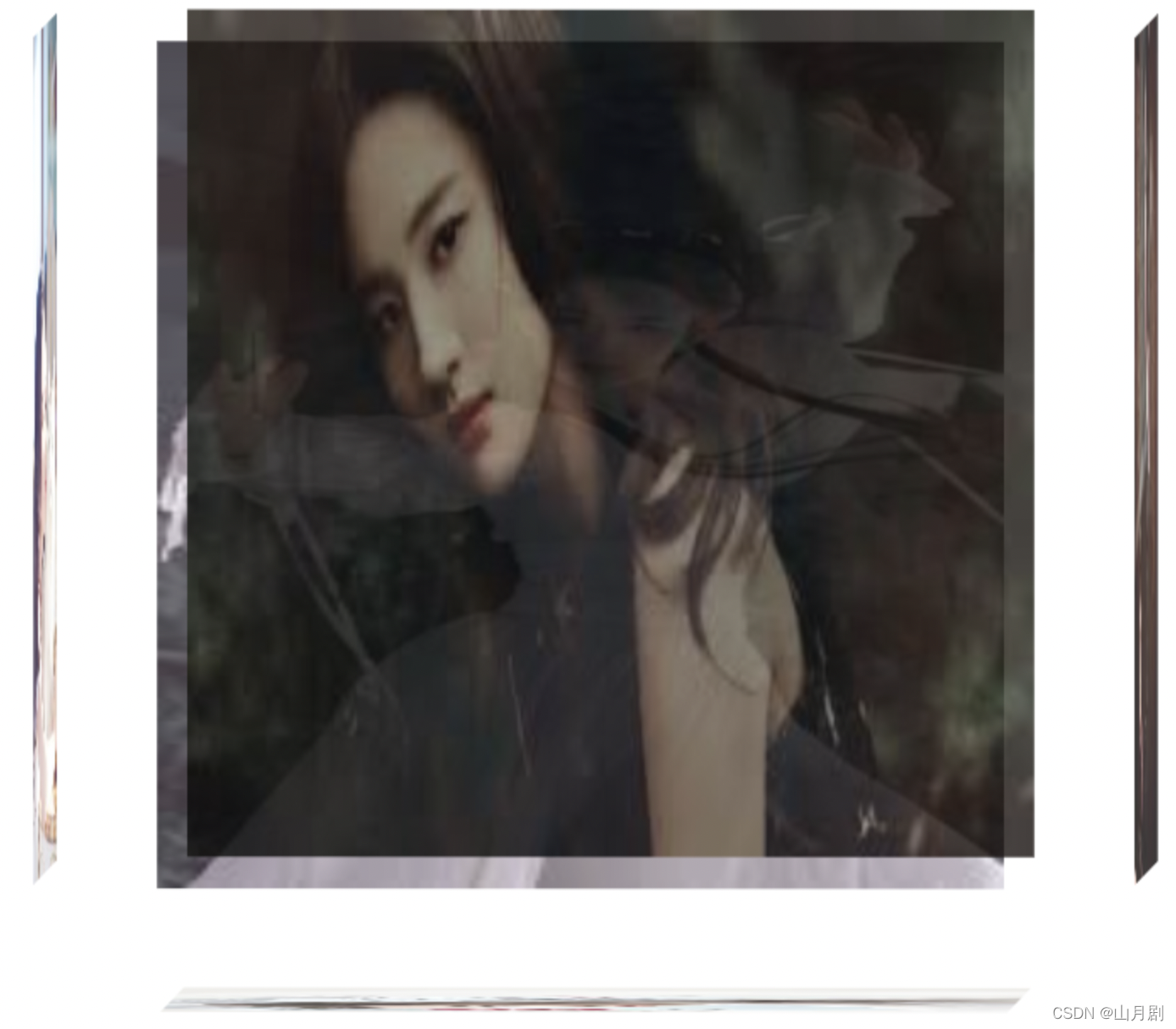
前端有趣的案例之HTML5+CSS3实现3D旋转相册
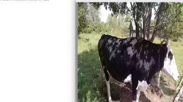
效果图:index.html<div class="container"><div class="box"><div class="left"><img src="https://encrypted-tbn0.gstatic.com/images?q=tbn%3AANd9GcTTY5I_M0jKX2s6MKDofX7GYERG1nI3cswwxK_r5jH
·
效果图:
index.html
<div class="container">
    <div class="box">
        <div class="left"><img src="https://encrypted-tbn0.gstatic.com/images?q=tbn%3AANd9GcTTY5I_M0jKX2s6MKDofX7GYERG1nI3cswwxK_r5jHL37L1_X2a&usqp=CAU"></div>
        <div class="right"><img src="https://encrypted-tbn0.gstatic.com/images?q=tbn%3AANd9GcSzibz8KOuKd3X0DaS826tYqI-xJMS_WR43E9gzWfZO_IAjeKdB&usqp=CAU"></div>
        <div class="top"><img src="https://encrypted-tbn0.gstatic.com/images?q=tbn%3AANd9GcQHoF63jZERlPKYv45wS2mkGMTOYUgBW3jWWz_1dpZxzQ3lRxak&usqp=CAU"></div>
        <div class="bottom"><img src="https://encrypted-tbn0.gstatic.com/images?q=tbn%3AANd9GcSTa7y2P-jbupq0Xkn6o7KrvrzAzlgVeVEGpkdy9r_dknLV3Iwe&usqp=CAU"></div>
        <div class="font"><img src=https://encrypted-tbn0.gstatic.com/images?q=tbn%3AANd9GcTWwJDq4tH57gvsHreN0okHTiYibawAgJEEJuKyx1-Wqzd13wdy&usqp=CAU"></div>
        <div class="behind"><img src="https://encrypted-tbn0.gstatic.com/images?q=tbn%3AANd9GcRRa1UpLT43QaMbM0-boABR8VdVI1cffpUf92HUicAqZQV6aO8X&usqp=CAU"></div>
    </div>
</div>
实现该效果使用了CSS3的"3D转换",“动画"和"过渡”
CSS3样式:
.container{
    width:800px;
    height:600px;
    margin:200px auto;
}

.box{
    width: 400px;
    height: 400px;
    margin: 100px auto;
    position: relative;
    transition: all 8s;
    transform-style: preserve-3d;
    animation: move 8s infinite linear alternate;
}

.box>div{
    width: 400px;
    height: 400px;
    opacity: 0.8;
    position: absolute;
    top: 0;left: 0;
    transition: all 1s;
}

.box img{
    width: 400px;
    height: 400px;
}

.left{transform: rotateY(90deg) translateZ(-200px);}
.right{transform: rotateY(90deg) translateZ(200px);}
.top{transform: rotateX(90deg) translateZ(200px);}
.bottom{transform: rotateX(90deg) translateZ(-200px);}
.font{transform: translateZ(200px);}
.behind{transform: translateZ(-200px);}


.box:hover .left{transform: rotateY(90deg) translateZ(-250px);}
.box:hover .right{transform: rotateY(90deg) translateZ(250px);}
.box:hover .top{transform: rotateX(90deg) translateZ(250px);}
.box:hover .bottom{transform: rotateX(90deg) translateZ(-250px);}
.box:hover .behind{transform: translateZ(-250px);}
.box:hover .font{transform: translateZ(250px);}

@keyframes move{
    from{transform: rotateX(0deg) rotateY(0deg);}
    to{transform: rotateX(13deg) rotateY(720deg);}
}

技术共进,成长同行——讯飞AI开发者社区
更多推荐
 0
0 0
0- 0


 已为社区贡献4条内容

所有评论(0)